The first US map colored for partisan leaning I started showing here is the one with just the counties, colored either red or blue:
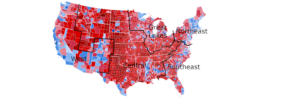
( 2020 United States presidential election results map by county )
But the main problem with these maps is they do not show the huge population density differences of the counties.
As a former mapmaker , technical illustrator, and computer graphics programmer, I got kinda obsessed with finding the best map that does not have this problem.
Here it is:

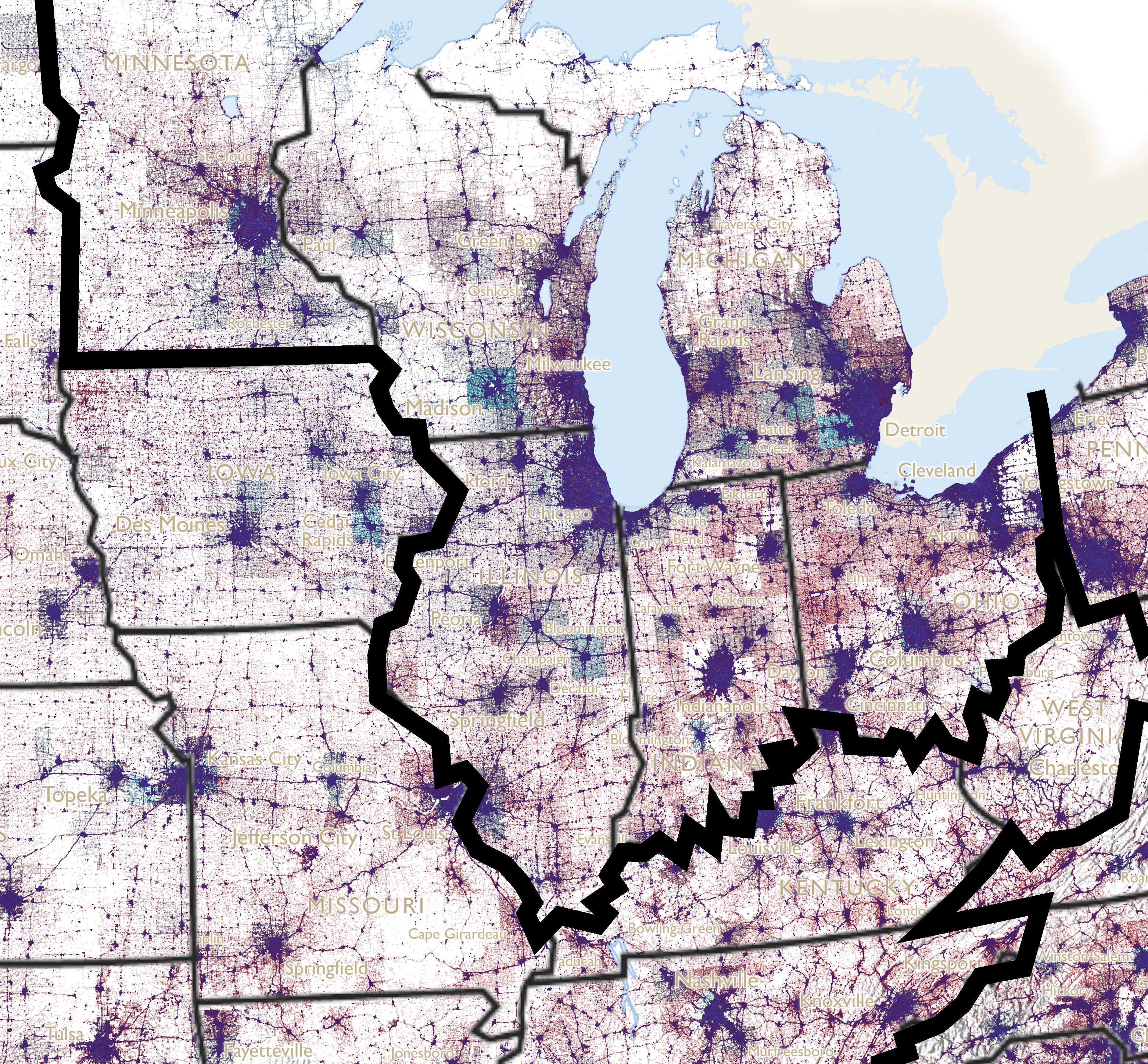
( Dot Density Map for the 2020 U.S. Presidential Election )
You notice immediately that the red counties in the Great Plains and Rockies and other sparsely populated places no longer erroneously make America look much redder than it is.
Here are the details about how the map was made:
Experiments with dot density – Part One -by Kenneth Field
Experiments with dot density – Part Two -by Kenneth Field
…I understand these two articles because I have studied engineering and mapmaking. BUT, I am sure they are very confusing to the average Joe.
Here are the basics:
Dense urban patches get 50% of a county’s votes, urban patches 35%, rural patches 15%, and uninhabited patches, such as lakes and nature preserves, 0%.
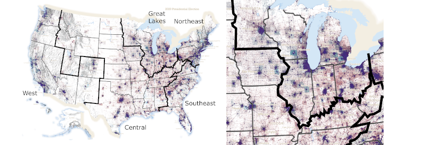
Here is my version of Field’s map with the state outlines and my proposed nations added:
( 2020 pres election dot map -highest resolution uploadable to blog )
The full-width map here on this blog is reduced in resolution, but when I use the map in posts about certain proposed new nations or about specific states or regions, I will try to use the highest resolution closeups.
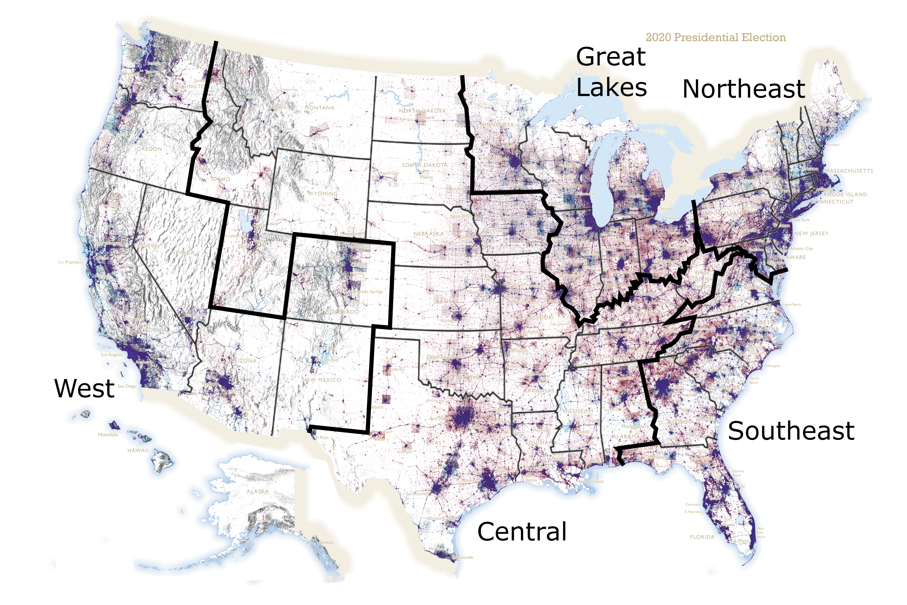
Here is an example:
( example closeup )
-And, here is the link you will go to when looking at the map, to get even more information about counties you see:
NBC News Election Results 2020
Click on “State results” near the top, to choose a state, then hover over a county to see exactly what the Trump v Biden numbers were.
—————–
P. S. :
There is one thing I really don’t like about the maps I just introduced…
Cities in the US tend to be blue, but the cities in these maps ALL look a very dark blue-purple that says nothing about how blue over red they actually are. This is because the resolution causes too much overlap of dots. Cities that were maybe 55% Biden look just like ones that were 80% Biden.
I found out though that if I go to the INTERACTIVE version of Field’s map, this problem is not true, if I zoom in to the maximum.
Here is what the Columbus-Dayton area of Ohio looks like on the interactive map zoomed in fully:
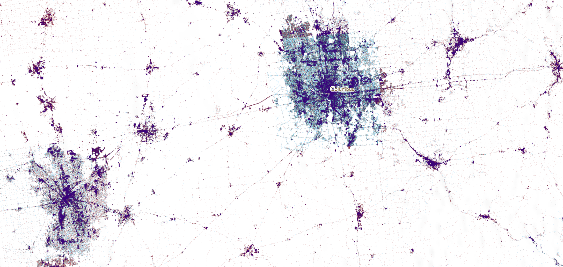
And here is what it looks like in all the non-interactive maps:
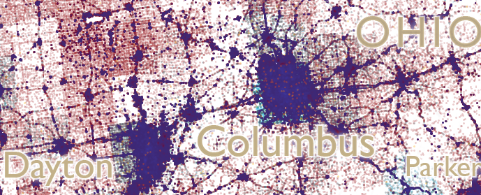
The upper map is MUCH clearer about how blue Columbus voted. The dense urban patches still become very dark areas, but the patches that are just urban but not dense urban do not black out this way. This is much better but not perfect, as far as portraying cities goes. But, the rural areas, which should be reddish like in the lower map, just look white. So, what shows the rural accurately shows the urban inaccurately and vice versa.
So there are no perfect, or even close to perfect maps.
I am still glad I discovered this about maximum zoom on the interactive map.
Oh, and before I close, I need to mention another great thing about the interactive version of Field’s map. -You can click anywhere on it to get the actual Trump and Biden numbers for the county you clicked on, just like you can do on the NBC News state maps.